Mobile Web Design
We can support your business with a range of mobile website solutions.
Why do you need a mobile site?
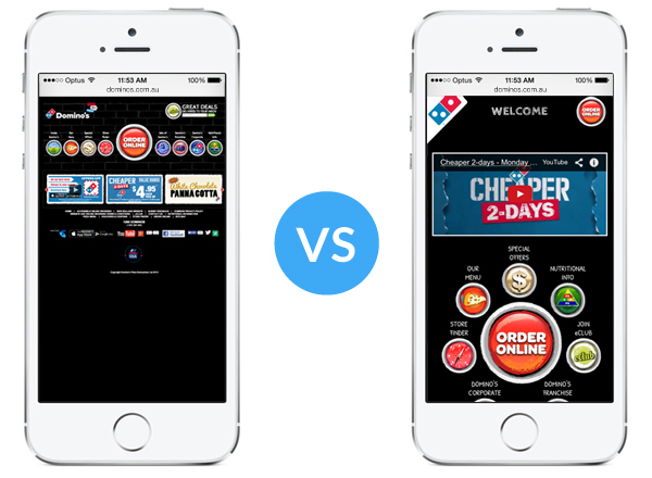
On average 20% of visits to websites now come from mobile and tablet devices. A website designed for desktop users is typically not suitable for mobile users, resulting in a hard to use design with the need to zoom in, as shown in the graphic below.
Mobile users have fundamentally different needs to desktop users. Often mobile users are on the move and don't have to time to read expansive content on a small screen, that requires a lot of scrolling down. A simple approach works best, with single columns of content and large buttons that are easy to see and touch (rather than click!). This approach can greatly improve reading comprehension and ease of use on a small screened device.
An obvious difference from the desktop is that a mobile user has a touch screen, not a mouse. This means that all menus and buttons need to large enough to be easily clickable by a fat finger. Also, mobile devices can be easily optimised for click to call functions, without the need to support old desktop browsers like Internet Explorer.
There are 2 main options for a mobile ready website, explained below.
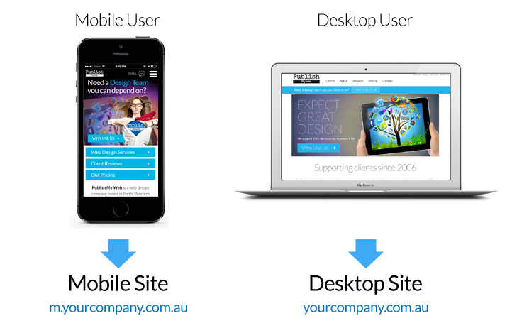
Option 1 – Separate Mobile Website
We can create you a brand new mobile website optimised for use on a smart phone. This is how it works.
- The mobile site sits on a sub-domain like mobile.yourcompany.com.au
- The mobile site is responsive, in that it changes to fit the width of the screen.
- Depending on the type of device a visitor is using, they are automatically taken to the desktop site or the mobile site.
Option 1 is also a good solution if you already have a website and need to add mobile functionality.
Option 1 is the most cost effective solution and is available as part of our Mobile Ready Membership plan of $99/month, which includes 10 hours per year of mobile design and support. Simply sign-up to the Mobile Ready plan and we will get to work on developing your mobile website.
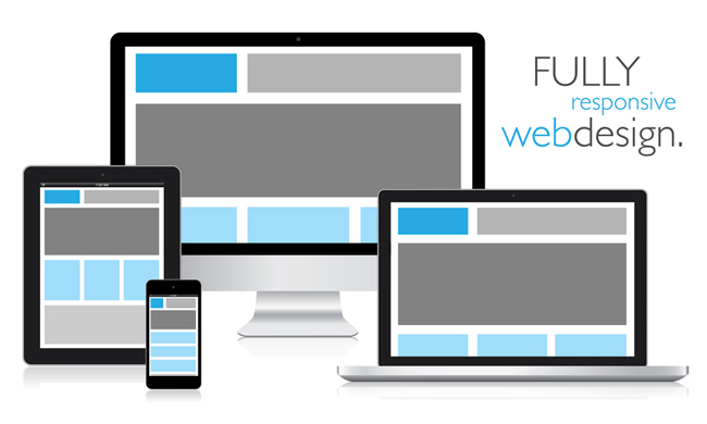
Option 2 – Fully Responsive Website
This is an option that can only be selected when creating a new website from scratch. A fully responsive website changes its appearance to fit the width of the device, from small mobile screen up to the largest of monitors. On small screens, content is pushed down the page in a long vertical column in order to fit the screen width. Horizontal menus are replaced by mobile friendly menus. Almost all new websites built by Publish My Web use a responsive approach.